Part of my thesis involves generating a statistics set known as Principal Component Analysis (PCA). PCA takes a group of statistics and, well, makes sense of them.
Actually, that’s not quite correct. PCA gives you columns of numbers called eigenvectors. The numbers are just numbers; it’s up to you to make sense of them.
To illustrate the value of PCA, consider the following list. Each item in the list is a measure, or indicator of vulnerability that a person has in the event of an earthquake. Do they make sense?
- Population – 65 years and older
- Family – Single parent
- Income – low
- Education – High school or less
- Unemployment
- Renter
- English – not spoken at home
- Occupation – arts or service
- Social dependence
- Population growth
- Family – Average size
- Population – 14 years and under
- Aboriginal identity
Okay, they make sense by themselves, but do they make sense as a group? Which is the most important? Are some related to each in the sense that when one indicator is high, another indicator is also high?
PCA takes these indicators and gives you columns of numbers. Here is one such column:
| Renter | -0.517039016 |
| Family – Average size | 0.421954814 |
| Population – 14 years and under | 0.409067414 |
| Income – low | -0.385866351 |
| Occupation – arts or service | -0.242320211 |
| Unemployment | -0.218579446 |
| Aboriginal identity | -0.192174588 |
| Social dependence | -0.147162482 |
| Education – High school or less | -0.057844989 |
| Family – Single parent | -0.055617301 |
| Population growth | -0.047615417 |
| Population – 65 years and older | 0.150799633 |
| English – not spoken at home | 0.204608869 |
Notice that I sorted the rows so that the top values, either positive or negative are at the top and the least values are at the bottom. The top numbers show us the most important indicators – the higher the number, the more important the indicator.
So what do these numbers tell us? Look at the first four indicators. Basically they tell us that areas of the city that have high percentages of renters do not have large families and population 14 and under, and that they tend to be low in income; this is indicated by the negative sign on each indicator. Conversely, the numbers tell us that large families and population 14 and under go together, but not with renters.
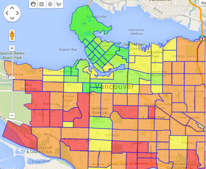
Are these patterns true? Let’s look at the map in several views.
 First, look at the Renters layer. This layer shows us that many people in the West End (the red part in top left), a densely packed area of 100,000 people in 100 square blocks, rent their dwelling units. First, look at the Renters layer. This layer shows us that many people in the West End (the red part in top left), a densely packed area of 100,000 people in 100 square blocks, rent their dwelling units. |
 Next, look at the Population – 14 years and under layer. This layer tells us that in the south, Population 14 years and under is high, while in the West End it is low. |
 Finally, look at the Family – average size layer. This layer is similar to the Population – 14 years and under layer; the south part of Vancouver has large families, while in the West End, families are not large. Finally, look at the Family – average size layer. This layer is similar to the Population – 14 years and under layer; the south part of Vancouver has large families, while in the West End, families are not large. |
These layers confirm the patterns that the column of eigenvectors indicated. PCA “makes sense” of data by showing us patterns in the data. That is its value.
Now if you have been paying attention, you might say, “Whoa! Why do we need PCA when we can look at a map and get an even more accurate picture?” Well, that’s another question, one that I don’t have time to answer here. Gotta get back to my thesis.
Now where are those eigenvectors again…?
