I’m on the last legs of my program now (not my last legs). My eighth core course to date is Spatial Statistics.
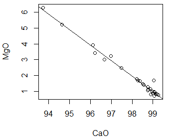
Statistics can help us to understand facts by grouping them into patterns that make sense for the data. For example, consider the graph to the right.  It is a scatterplot where each point represents the value of magnesium for a given value of calcium in limestone.
It is clear from the pattern of the points that there is relationship between these two values. As calcium increases, magnesium decreases. But can we define this relationship more precisely?
Looking at the second graph we see a regression line drawn through the points. This line tells us the expected value for magnesium for a given value of calcium.
Now there may never be an exact calcium / magnesium value along the regression line. Also, if we add more points to the scatterplot and recalculate, the regression line is likely to change. The point of the regression is not to foretell all future calcium / magnesium points. Rather, it gives us a clear picture of the relationship between calcium and magnesium as it exists now.
